MAJOR 1.3
1.4.1 Design Process
Back
To do list:
Week1 to do: (research and data collection+ starting making content)
-Create questionnaire for user testing and conduct it on discord server.
-Design different layouts for content.
-Start creating and(possibly animate) posters for article’s content.
Week 2: (finishing content+VR experimentation)
-pretty much done with article/chapter’s animated posters. (brainstorm all the data collected via user testing).
-create VR space on mozillahub engine.
-Experiment with VR (2-days).
Week 3:(finishing up + extras for presentation)
-possibly branding(making ex.business cards/mockups for advertisements).


Based on the data and user-feedback collected through the questionnaire, the following can be deduced and considered when it comes into designing and creating the virtual reality exhibition:
-The graphics will need to have balanced colour palettes of dark and bright colours.
-the virtual space will need background music/sounds in order to captivate the users further.
-The exhibition will be designed and put in a layout that will make you explore at a slower pace.
-The exhibition space will be set in a abstract environment.
-exhibition layout and space will have to be free flow and spacious so that it can be experienced via free-roaming.
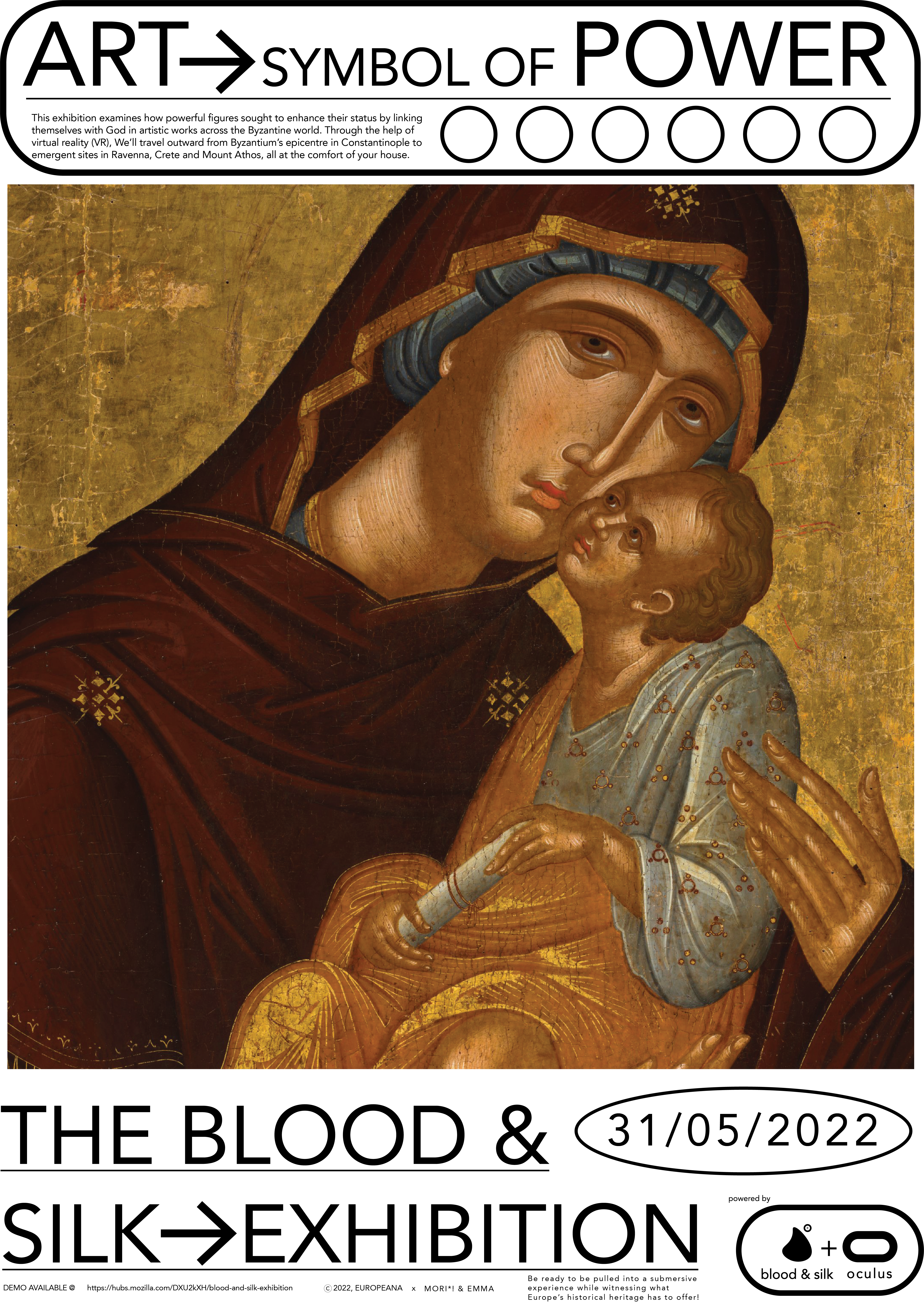
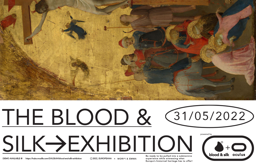
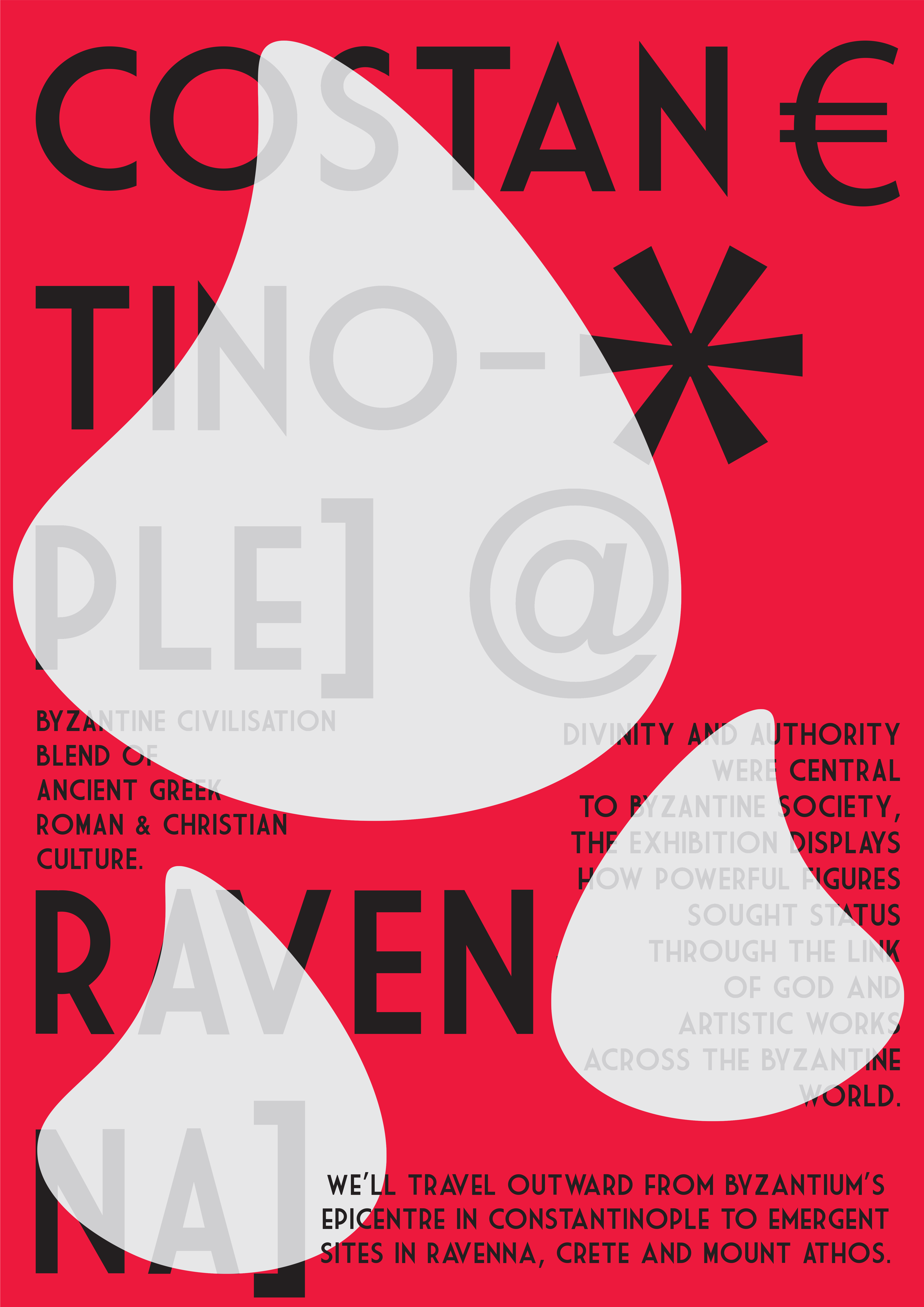
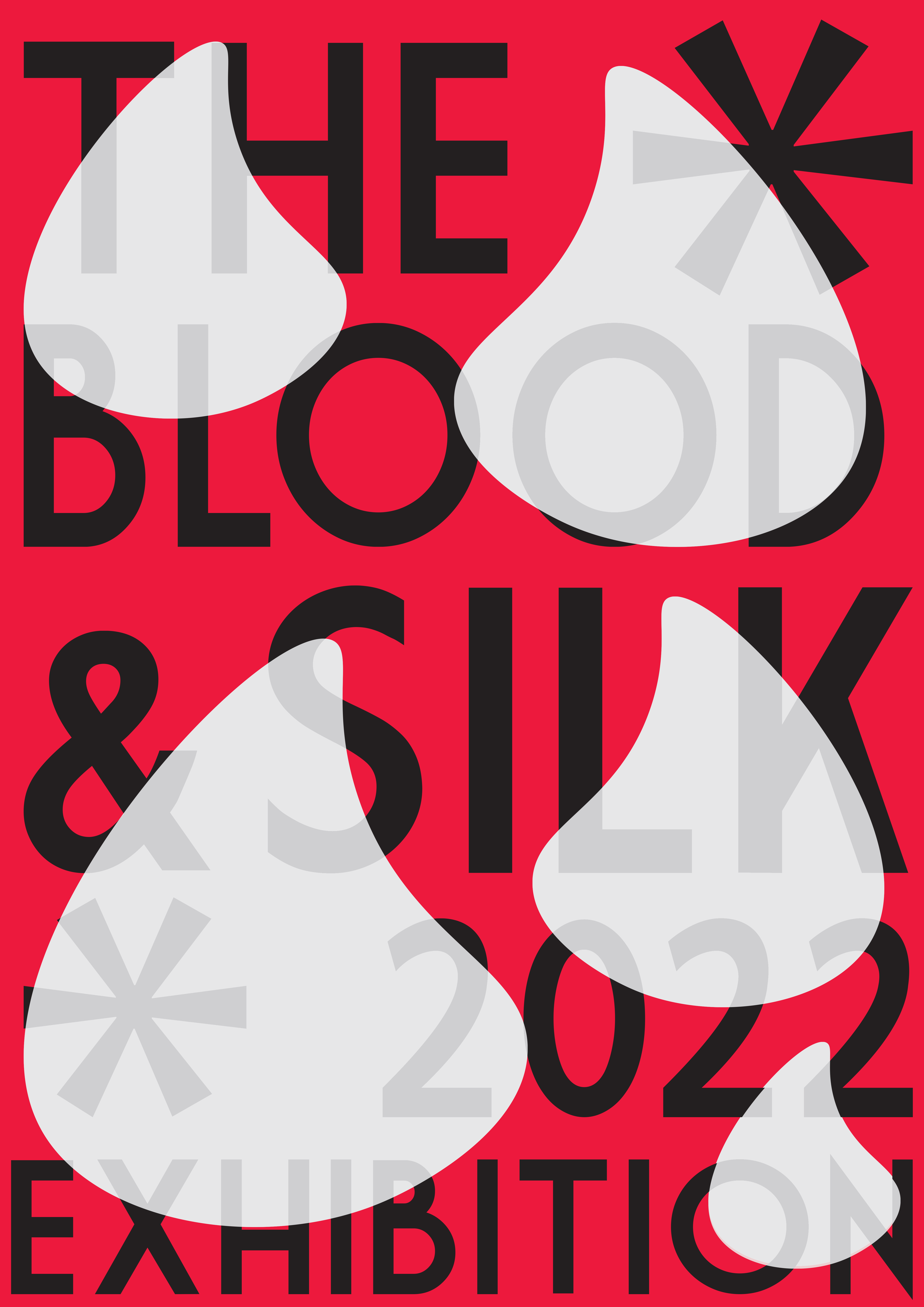
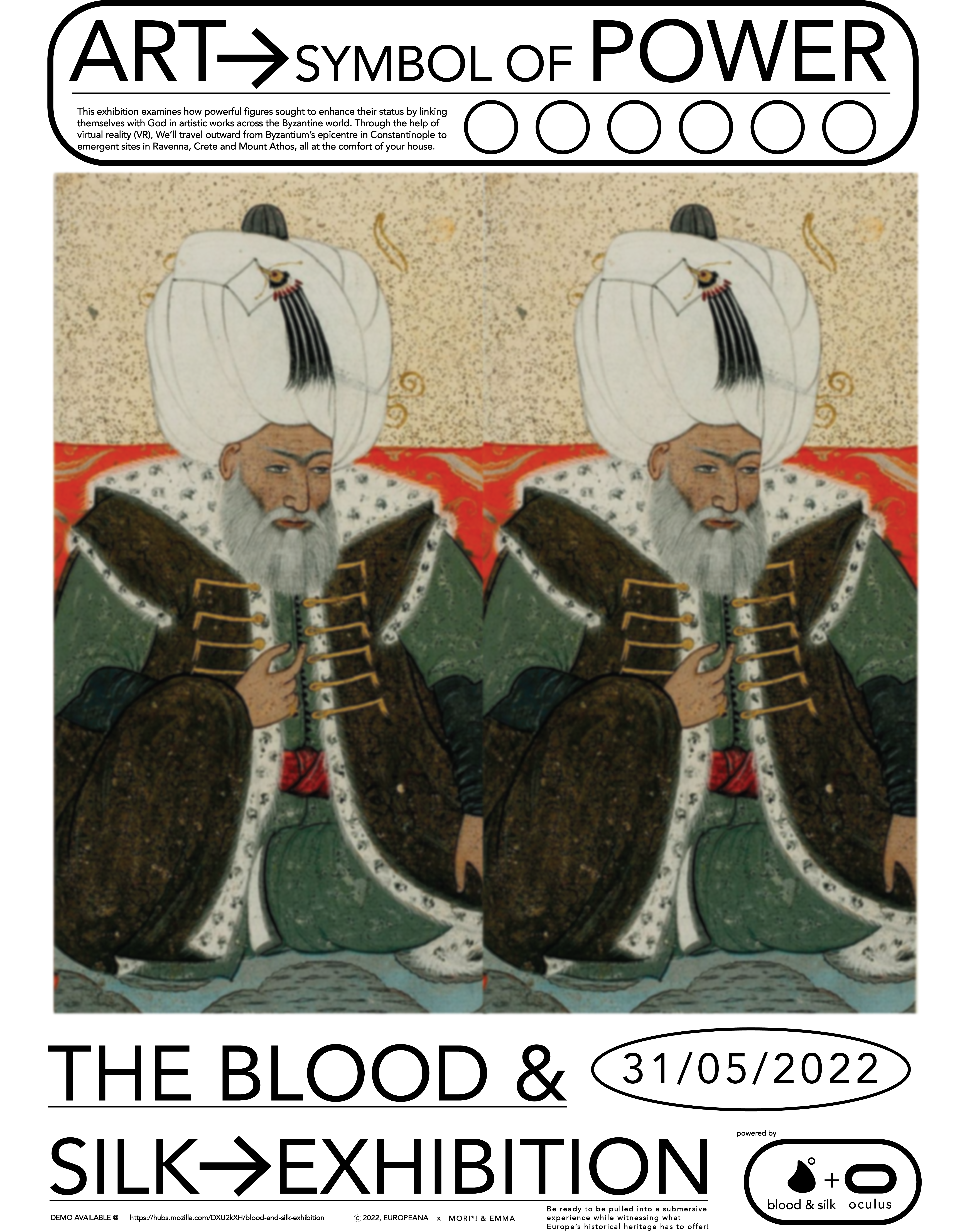
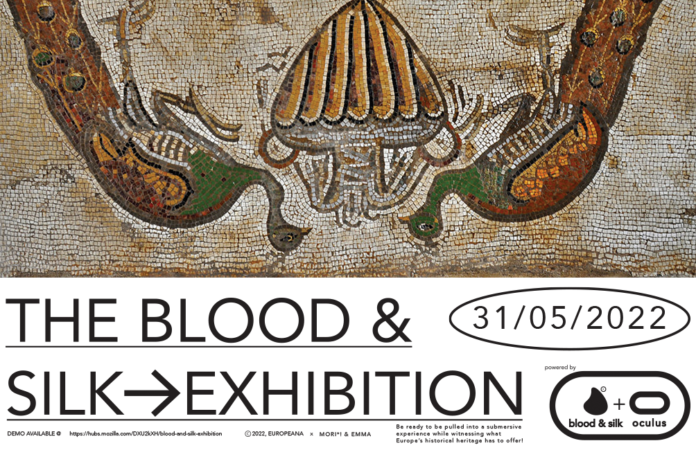
The following graphics are the final version of content that will be displayed within the VR EXPO: (the graphics have been made through the use of illustrator and photoshop.
The screenshots below, depict different illustrator files in which I experiment and play with the different values and properties of both images and text. (In order to create a cohesive style that respects the criteria and findings of our intended users).
For instance in this frame, I was trying to figure out how to create a visual element/logo that would link the whole exhibition on a visual level.
The posters and invitation cards above would be for the exhibition.
(in a hypothetical scenario where the project would be completely flawless and finalised we would want to reach more potential users through the use of marketing).
User testing/questionnaire
-Execution of the project-
Research:Emma & Mori*! (Gabriele)
Graphics:Mori*! (Gabriele)
Animations:Emma
3D-expo space:Mori*! (Gabriele)
Extras (poster/invite cards):Emma & Mori*! (Gabriele)
Quick sketch of the virtual space we wanted to create. when designing it, we had to keep in mind the various wants of the user; spacious, abstract and suited for free roaming movement.
Perfect scenario:
Although we’re relatively happy with the results and execution, if we had more time to develop the project, we would envision the following;
-The exhibition space and content displayed, runs smoothly and little to no bugs.
-The expo would include more articles and open spaces to explore within the map.
-available and easy to access on all devices.
When creating graphics I tried different colour schemes, but in comparison to the final ones, the legibility of text in these is much harder.
One of the hardest challenges within this project was to create graphics that contain informative content and yet still visually entertaining. In addition creating a visual style that is maintained and cohesive throughout the work was difficult since it was important that we didn't produce repetitive visuals, since it would defeat the purpose and appeal of the project.
(Since I encountered issues with hotglue, more specifically doesn't let me create new pages, I had to put within this one all the content that falls under category 1.4).
Criteria for graphics and visual language:
- Elegant/clean and playful
-rational
-good ratio of image to text (large images and short text in large), paragraphs in small.